

Forget the old idea that a website can be “fine” on a computer and only “eh” on a phone. Today, more than six out of every ten online orders come from a pocket screen. Because of that, building your furniture store site with phones in mind from the start isn’t just clever—it’s mandatory if you want more sales and better rankings on Google.
Speed is the next ruthless reality. If a customer has to wait for a picture of a cozy armchair to appear, they’ll be scrolling somewhere else in seconds. Make your site snappy by squashing images to a reasonable size, trimming unnecessary code, and letting a content delivery network do the heavy lifting of serving files quickly, no matter where the shopper happens to be.
Once the page finally appears, navigation has to feel effortless. Tap targets should be large enough for thumbs, drop-down menus ought to stay put when scrolled, and buttons should shout “press me” without actually shouting. Small design tweaks at this stage save countless frustrated taps.
Of course, pixels still sell furniture better than words. Crisp photos, 360-degree spins, and even AR views that let users drop a virtual sofa into their cluttered living room keep wandering eyes glued to the screen. If they can’t practically sit on the product before checkout, odds are they won’t bother.
The final stretch is the checkout lane. If filling in addresses looks like an endurance test, carts get abandoned faster than you can update your inventory. Auto-fill, a range of payment choices, and a little progress bar that shows they’re almost there take the sting out of buying.
Last, remember that perfecting a mobile store is a never-ending job. Regularly check bounce percentages, conversion trends, and responsive gaps that may have crept back in after an update. Keep fixing, learning, and tweaking, and those couch-side customers will turn into real orders that brighten your bottom line.
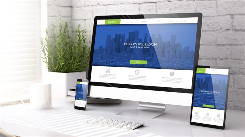
These days, if your furniture store's website wasn’t built with smartphone shoppers in mind, you’re probably missing out on a lot of business. Mobile-first design has moved beyond being just a buzzword; it’s become an absolute must in the world of online sales. So, let’s explore a few practical steps for crafting a mobile-first sit e that looks appealing and turns casual visitors into repeat customers.
The case for mobile-first design couldn’t be clearer. More than six out of every ten online transactions now happen on handheld devices, and that share keeps climbing. On top of that, Google bumps mobile-friendly sites up its search results, so an awkward mobile layout can actually bury your store where shoppers are unlikely to stumble across it. All of this means that making your site easy to navigate on a phone pays off in happier customers, bigger sales, and better visibility in search engines.
First, you need to make your pages load at lightning speed. Research shows that half of all mobile users will leave a site that takes longer than three seconds to appear. That quick tap to check your latest sofa could easily turn to disappointment and a missed sale, so trimming those precious milliseconds is crucial. Start by compressing images with tools like TinyPNG. The files will look every bit as sharp, but they’ll take up far less space, allowing browsers to pull them up in the blink of an eye.
1. Trim Your Code and Boost Speed
Start by cutting out any scripts and plug-ins that your site no longer needs. The less heavy code the browser has to drag along, the faster everything feels. Next, partner with a content delivery network. Because CDNs store files on multiple servers around the world, visitors pull images and styles from the server closest to them, slashing load times. And while you’re at it, fire up a speed testing tool like Google PageSpeed Insights. Those simple audits can tell you where the bottlenecks are hiding, so you fix problems instead of guessing where to look.
2. Make Mobile Navigation a Breeze
Screen real estate on phones is precious, so your navigation should take up little space while pointing users in the right direction. The classic hamburger menu works wonders here; it cleans up the header but keeps every option a tap away. Pair that with a sticky bar that follows the user as they scroll, showing core links—Home, Categories, Cart, or whatever makes sense for you. Finally, check that every button and link is big enough for fingers, not just cursors. A generous target means fewer frustrating mis-taps, and that simple fix can nudge more customers down the checkout lane.
3. Polish Product Pages for Touchscreen Shoppers
When shoppers visit your product page, you have one chance to win them over, so make the experience feel premium on a phone. Start with sharp images that appear quickly, then add a zoom feature so details never get lost. Swap clunky click-through galleries for smooth scrolling ones, so users can swipe left and right with a thumb. Everything else should follow these two rules: speed and clarity. Keep copy concise, buttons prominent, and the Add to Cart action just a heartbeat away. Get those bits right and your mobile page becomes a tiny sales assistant that works around the clock.
4. Make Your Call-to-Action Shine:
Your “Add to Cart” and “Buy Now” buttons should be bold and brightly colored so shoppers can find them in a heartbeat. A touch target at least as wide as the palm of a hand also helps for quick taps on a smaller screen.
Craft Easy-to-Read Text: Keep fonts large enough to read without squinting, and use short paragraphs or bullet points so information flows naturally. When descriptions get cluttered, customers get lost; when they feel effortless, sales follow.
Pull Out the Must-Know Details: Give quick access to key specs like size, weight, and materials right near the top of the page. Shoppers often hesitate when they have to hunt for details, so removing that friction can nudge them confidently toward the checkout.
Streamline Mobile Checkout: Cart abandonment spikes on phones because filling out long forms feels like a chore. Cut that risk by letting auto-fill handle addresses, offering one-tap payments through Apple Pay or PayPal, and including a visible progress bar so customers never wonder how much longer it will take.
5. Show, Don’t Just Tell:
Furnishing a room is a visual puzzle, and mobile screens can often leave the picture half-finished. Use full-screen photos that let fingers pinch-to-zoom, offer 360-degree spins so every angle is covered, and add an AR feature that places the couch directly in the living room for an instant reality check.
Tip: A beautifully arranged room shot does more than show off a sofa; it tells a story. When customers can see a piece of furniture in a stylish setting, they start to imagine it in their own living room. That little mental leap can turn interest into a sale.
6. Check Your Site on Every Screen
Smartphones and tablets come in all shapes and sizes, and your site needs to look great on each one. A layout that feels perfect on a desktop can fall apart on smaller screens, so make sure it adjusts smoothly wherever it’s viewed.
Here’s how to cover your bases: Run Google’s free Mobile-Friendly Test to catch any immediate red flags. Then pick up a few different devices—an iPhone, an older Android, maybe a tablet—and scroll through your pages. For a wider check, services like BrowserStack let you preview your site on dozens of popular models.
When your furniture store website design flexes to every format, visitors enjoy the same clean experience whether they’re at home or on the go.
7. Boost Your Mobile Search Ranking
People rarely search for furniture sitting at their desk. If your site isn’t easy to find on a phone, you risk losing customers before they even land on your page. Solid mobile SEO for furniture stores helps push your store toward the top of local and organic results.
Start with local optimization. Dropping phrases like “furniture stores near me” into titles and headers lets search engines know you serve nearby shoppers. Structured data is another handy tool; it highlights stock status, opening hours, and ratings so the right details appear in search snippets. Don’t forget images—resizing them speeds up loads, while alt text gives search bots an image summary.
Mini Tip: Write meta descriptions that are quick to scan and hint at a benefit. A well-crafted blurb can convince someone to tap your link instead of four others.
8. Keep an Eye on the Numbers
Launching a mobile-first site is just the beginning. After the fanfare, lean on analytics to see what’s working and what stalls. Slow pages in the evening? A high bounce rate on product images? Collect the data, make targeted tweaks, and test again. That cycle of observation and adjustment is what really keeps the shopping experience fresh and friction-free.
Things to keep an eye on:
-
Bounce rate: Are shoppers leaving as soon as the page loads?
-
Time on page: Or are they sticking around to read and scroll through?
-
Conversion rate: Most importantly, can mobile users actually finish the deal?
Helpful tools like Google Analytics and heat-mapping software will show you where folks stumble, letting you tidy up the experience.
Final thought
Today’s customers are browsing furniture late at night, on their commute, or while sipping coffee. They won’t wait for a desktop site to load, so a mobile-first design has gone from luxury to necessity if you want to stay in the game and boost sales.
By zeroing in on speed, simple navigation, bold visuals, and thumb-friendly buttons, you can turn casual visitors into repeat buyers. Pick one or two suggestions that fit your schedule this week, and keep adding as you go. You’ll see the difference before long.
FAQs
1. Why is mobile-first design important for furniture store websites?
Mobile-first design ensures that your website provides an optimal experience for users browsing on mobile devices. With the majority of online traffic and purchases coming from mobile, a mobile-first approach helps improve engagement, conversions, and SEO rankings.
2. How can I improve the speed of my mobile website?
-
Compress large image files using tools like TinyPNG.
-
Minimize unnecessary scripts and plugins.
-
Use a content delivery network (CDN) to deliver content faster.
-
Regularly test your website speed using tools like Google PageSpeed Insights.
3. What are the key features of a mobile-friendly navigation menu?
-
A hamburger menu to save space and keep options accessible.
-
Sticky navigation bars for quick access to essential pages like “Home” and “Cart.”
-
Tappable buttons and links that are large enough for easy interaction on smaller screens.
4. How can augmented reality (AR) benefit a mobile furniture store website?
AR tools allow customers to visualize how a piece of furniture will look in their space before purchasing. This reduces uncertainty, builds confidence, and increases the likelihood of conversion.
5. How do I test the responsiveness of my website across devices?
-
Use Google’s Mobile-Friendly Test to identify potential issues.
-
Test your website on multiple devices, including iPhones, Androids, and tablets.
-
Leverage cross-device testing tools like BrowserStack to ensure a consistent experience.